LD12: Using BootStrap due Thu 20 Nov 13:20

Preparation for Lab Day
In preparation for lab day, do these actions:- Turn off the CoPilot extension in VSCode. This prelab work must be done
without any AI help.
- Make sure you don't have any uncommitted work in your workspace. Then pull
from the upstream remote to get the new hw12 directory.
- In the new hw12 directory there is a document called
bootstrap.html that pulls in the Bootstrap CSS and JS utilities.
- Visit your poemlayout.html document from hw03 and copy the
contents of the body into bootstrap.html. Also, copy the
hw03/poemlayout.css document into hw12. (Also copy the logo file
if you have one). Add a link tag to bootstrap.html to include the copied
poemlayout.css file. This newly added link tag should come AFTER pulling
in the Bootstrap CSS document.
- Remove all commands from hw12/poemlayout.css that involve positioning,
margins, padding, floats, and width commands. Also remove the box-sizing
commands because bootstrap is doing that for us now. i.e., remove all CSS
commands except for your color scheme!
- Our eventual goal is to get bootstrap to produce a responsive design
similar to our target found here:
responsivelayout.jpg.
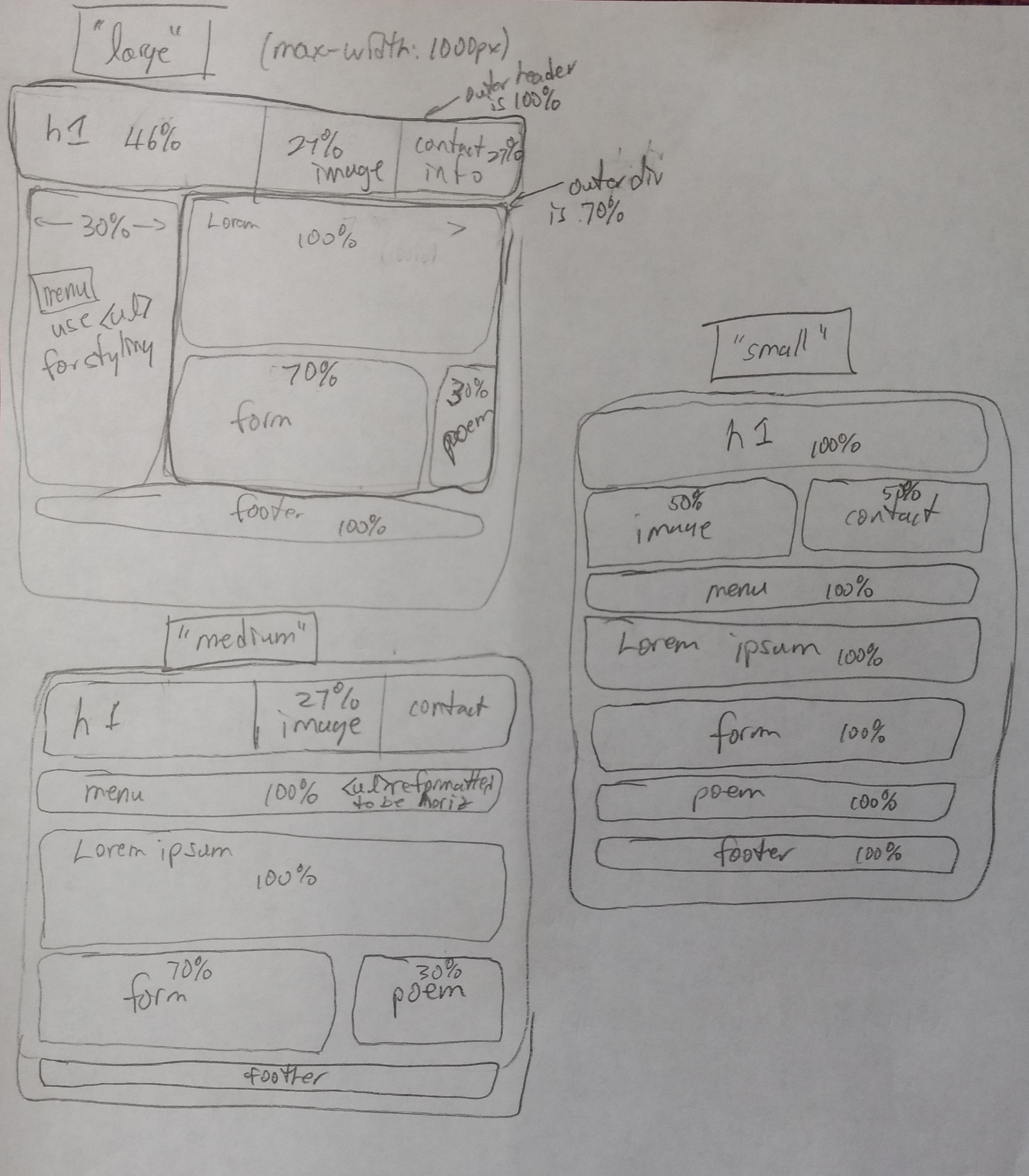
NOTE: For this lab day assignment you will be making wireframes showing
column counts for each row in each of the three sizes/layouts (based
on Bootstrap's responsive grid scheme).
- Take a look, again, at the basic design we will be moving towards.
Rather then depending on the exact percentages to guide our design,
though, we will “bend to the framework” and view it as a 12-column
layout. For example, if we want two panels to be 30% and 70% wide,
respectively, then we consider that 30% of 12 columns is 3.6 columns. So,
we'll leave 4 (or perhaps 3) columns for the 30% panel with the remaining
8 (or 9) columns for the 70% panel.
- On paper, draw a new set of diagrams that show the large, medium, and small wireframes but with the number of columns to be allocated for each div. Bring your paper with you to lab day.
On Lab Day
- Begin by showing your modified diagrams and your bootstrap.html
document to the instructor.
- Recall that bootstrap is designed as a mobile-first framework. So, begin
by adding the necessary HTML divs and bootstrap classes to generate a
responsive layout that properly renders the small layout.
- Then continue your modifications until it transitions between the small
and medium layouts.
- Then continue your modifications until it transitions between the large
and medium layouts.
- Now, replace the menu with one of the bootstrap navigation stylings.
See: https://getbootstrap.com/docs/5.3/components/navs-tabs/ for
some ideas abouts moving from a vertical to a horizontal arrangement.
- Show your work to the instructor. If you finish early you can start work on the homework assignment.